Let's look on simple website creation flow.
1. Your idea -> 2. Find design/hire designer -> 3. Implement/customize design
The step one is obvious. With the second step: you go to designers agency or find template online. The third step usually is the most difficult, because you want to change font, pictures, icons, text doesn't exactly fit, etc.
The above process is classic waterfall, with no step back in 99.99%. But is it right?
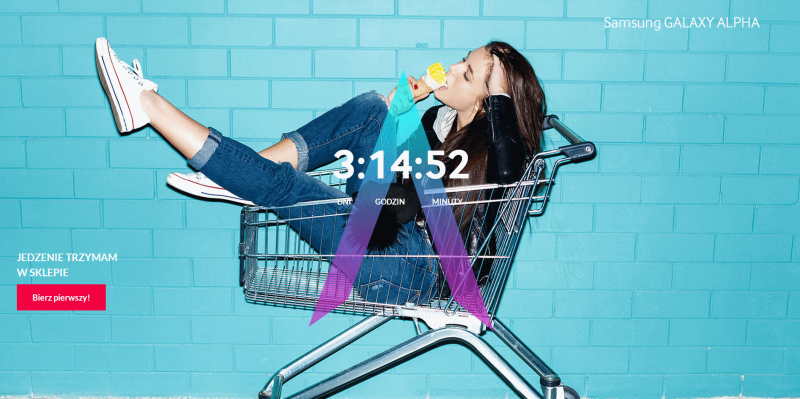
Yesterday I clicked Samsung adv on twitter, without any special reason, probably by accident. They are counting down to new Samsung Alpha (whatever it is). The new page loaded and I saw below: 
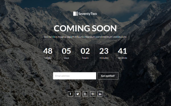
Then it transform to this: 
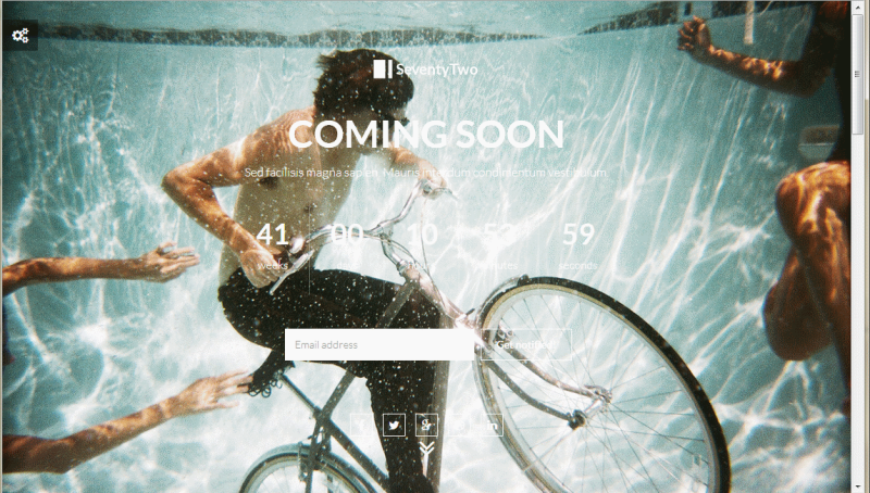
And finally this: 
At least on las, t presented image I saw the counter clearly. But what happened to this counter? Let's try to reproduce the probable process of creating this site, with creating my own :)
- The idea: we need counter to present when MyProduct will be available
- I need to find template (or hire designer). I opened WrapBootstrap and find a proper one.
->Done! It will be: SeventyTwo - Premium Coming Soon. And it look quite nice
- The most difficult step. Let's customize it. "MyProduct is not about mountains, it is about bikes and it needs more lighter background" - so let's apply changes:

So PLEASE add one more step in your workflow:
1. Your idea -> 2. Find design/hire designer -> 3. Implement/customize design -> 4. Verify your customization with the designer